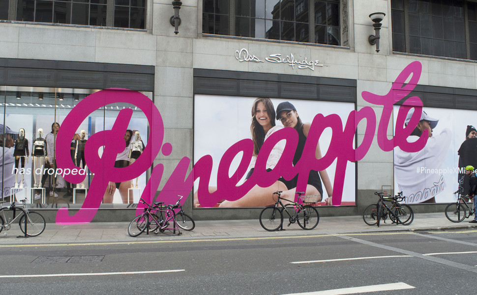
Miss Selfridge wanted eye-catching retail graphics to stand out from their competitors. Discover how we achieved this.
De Vere Hotels Textured Map
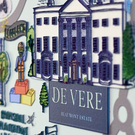
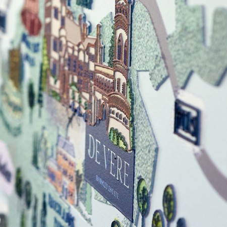
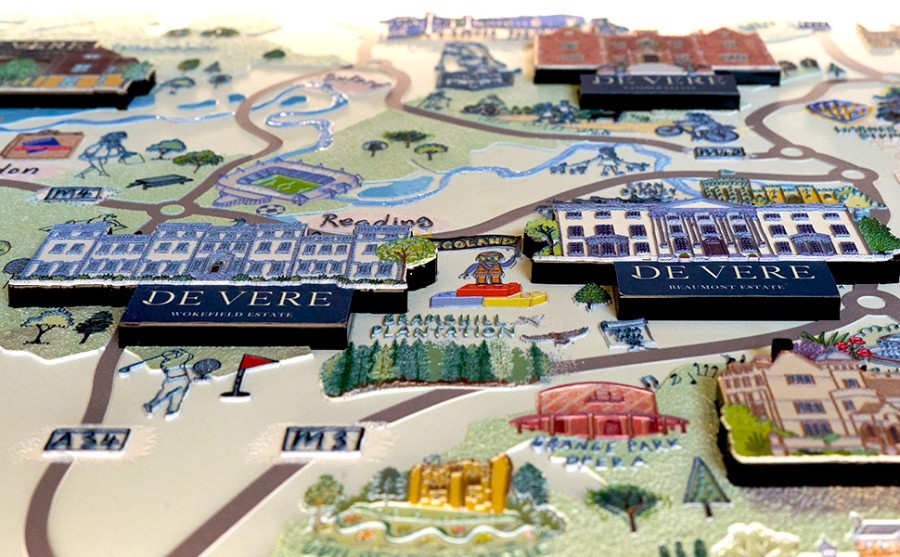
As the go-to provider of Tactile Printing in the UK, we were kindly recommended for an exciting project with the De Vere Hotel Group. The project aimed to revitalise hotel reception areas by creating inclusive, textured maps to show the hotels and their local areas, enhancing accessibility and guest engagement.
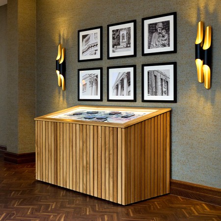
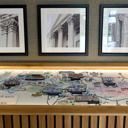
The prestigious De Vere brand is known for its multiple luxurious country estate hotels and state-of-the-art conference venues across the UK. To make visiting a De Vere Hotel a smooth and enjoyable experience the brand team were keen to display a 3D map of the grounds and nearby attractions. The map needed to be inclusive to all guests and meet DDA regulations for accessibility.
Artistic Process
The original artwork was an artist-drawn map of the hotel locations. We created numerous layers within the picture and worked on developing tactile ink and varnish heights to highlight areas of interest. These layers ranged in tactile depth from 0.5mm to 2.5mm. Additionally, we mounted the hotels onto laser-cut-shaped blocks, which were further enhanced with textured printed SAV. This approach created additional depth and made the hotel locations stand out prominently.
Designed for Accessibility and Inclusivity
To further enhance the use and accessibility of the maps, we encased them within a light oak frame that is sloped to allow guests to easily view and touch the textured surface. Textured braille and textured sensory text were added to allow blind and partially sighted guests to understand the messaging and Illustrations.
Lighting
As lighting varies within the De Vere Hotel portfolio LED modules were rebated into the oak carcass to create a face wash of light, further highlighting the map by enhancing the ink texture of the surface and illustrations.
Client Interaction and Feedback
So that we could get a clear brief and ensure the De Vere team was happy with our proposal, we carried out a number of internal meetings before the production of samples. The client was so pleased with the end product and the tactile ink finish that they also requested a wall-mounted version of the map. This was created using 10mm white and black acrylic with tactile-printed ink on top and was mounted away from the wall using chrome standoffs.
Tactile printing is a unique graphic display format that makes flat images come to life. Are you looking for the right team and the right product to support your brand's success? Speak to us to get started.
Related Articles
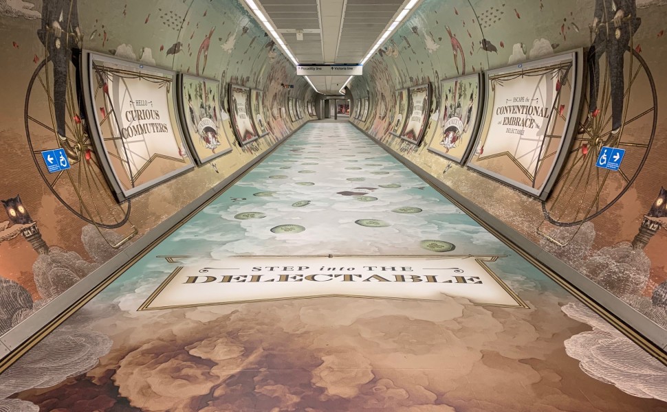
To mark the launch of Hendrick's new Rose & Cucumber Gin we produced an award winning scented display that filled commuters noses.
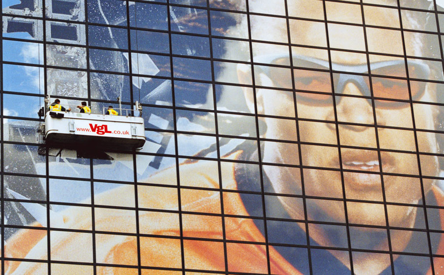
Created and installed by VGL, this campaign holds the world record as the largest building graphic on the planet.
Contact Us.
Ready to get started? Get in contact with our knowledgeable staff who will be happy to assist.
0118 922 1300
[email protected]
268 Elgar Road South
Reading
Berkshire
RG2 0BT